The problem
I keep a paper Bullet Journal. The notebook is where I actually think, but a thought doesn’t always show up when the notebook is in front of me. It shows up on the subway, mid-call, halfway through a meeting. Notes apps are designed to solve that gap by becoming the thought’s final destination: folders, tags, formatting, semantic search. JournalApp starts from the opposite premise. The phone shouldn’t compete with the notebook for that thought; it should just hold it for a moment.
The Bullet Journal method itself was created by Ryder Carroll, a digital product designer who built an analog system to work around his own difficulty with traditional note-taking: rapid logging with short signifiers for tasks, notes and events, and a monthly ritual of migrating whatever still matters forward while letting the rest go. It’s less a planner than a practice, closer to mindfulness than to productivity software. I only picked it up recently, but it’s become something close to a guide for how I structure my days, and JournalApp exists to protect that practice rather than replace it.
This covers a very specific, very personal need. I wanted an app with just the features I actually needed, nothing that would distract me, waste my time, or pull me into doomscrolling. Just a place to capture something temporarily, without distraction, that would then complement my paper notebook.
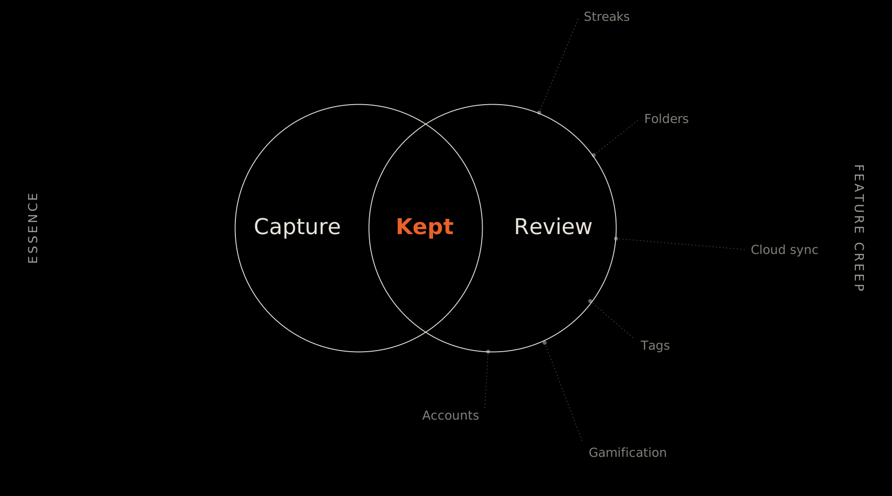
That’s why JournalApp isn’t a notes app. It’s a fast-capture layer whose only job is to keep a fleeting thought alive until it can be written by hand. The notebook is permanent; the phone, deliberately, is not.
The notebook is where thinking happens. The app’s only job is keeping a thought alive until it gets there.
— JournalApp Manifesto
Philosophy and principles
Before writing a single line of SwiftUI, I spent the entire first phase of the project defining what JournalApp is and, more importantly, what it refuses to become. That work became the product’s Playbook: philosophy, principles, mental model, and an explicit list of future boundaries. Every decision after that, from the character limit to the icon’s colour, traces back to one question:
Does this strengthen the relationship between the user and their notebook, or the relationship between the user and JournalApp?
The manifesto boils down to seven lines, and I held them as a design criterion across the project’s 22-day sprint:
- Software doesn’t have to compete for your attention. This one won’t.
- Handwriting is slow on purpose. That’s not a flaw to fix.
- We say no far more often than yes. Every feature added is a small vote for the app over the notebook.
- Migrating a thought isn’t “completing” it. It’s sending it home.
- JournalApp isn’t trying to become anyone’s second brain.
- Success doesn’t look like engagement. It looks like barely remembering you used the app.
That last line also defined the product’s explicit boundaries: no tags, folders, projects, rich text, attachments, accounts, cloud sync, gamification, streaks, achievements, or usage statistics. All of it was discussed and deliberately rejected during discovery, not for lack of time but because every one of them would turn JournalApp into the destination instead of the bridge.
Process: five phases, twenty-two days
I structured the project as a 22-day sprint with a clear plan for each phase, to avoid improvising product decisions along the way.
Philosophy, principles, mental model, information architecture.
Moodboard, typography, colour, iconography, paper textures.
Xcode project, home screen, quick capture, edit/delete, migration, search and menu.
Visual direction review, motion and haptics, typography and colour, microcopy, internal testing.
TestFlight prep, screenshots, icon, splash screen, release notes, final QA.
Every structural decision was recorded in a decision log with its own reasoning, so it could be audited later instead of relying on memory. A representative sample:
| Area | Decision and rationale |
|---|---|
| Identity | JournalApp is a companion, not a notes app: it exists only for the gap between a thought appearing and it reaching paper. |
| Notation | Bullet Journal shorthand is recognised automatically while typing (·, –, °, *); there’s no type-selector in the UI, so no decision is added to the moment of capture. |
| Saving | No save button; autosave on every change. Life interrupts capture constantly, and losing a thought is the one failure this product can’t afford. |
| Migration | “Migrate,” never “complete.” Migrating is a handoff, not a close: the app has no idea what happens to the thought next. |
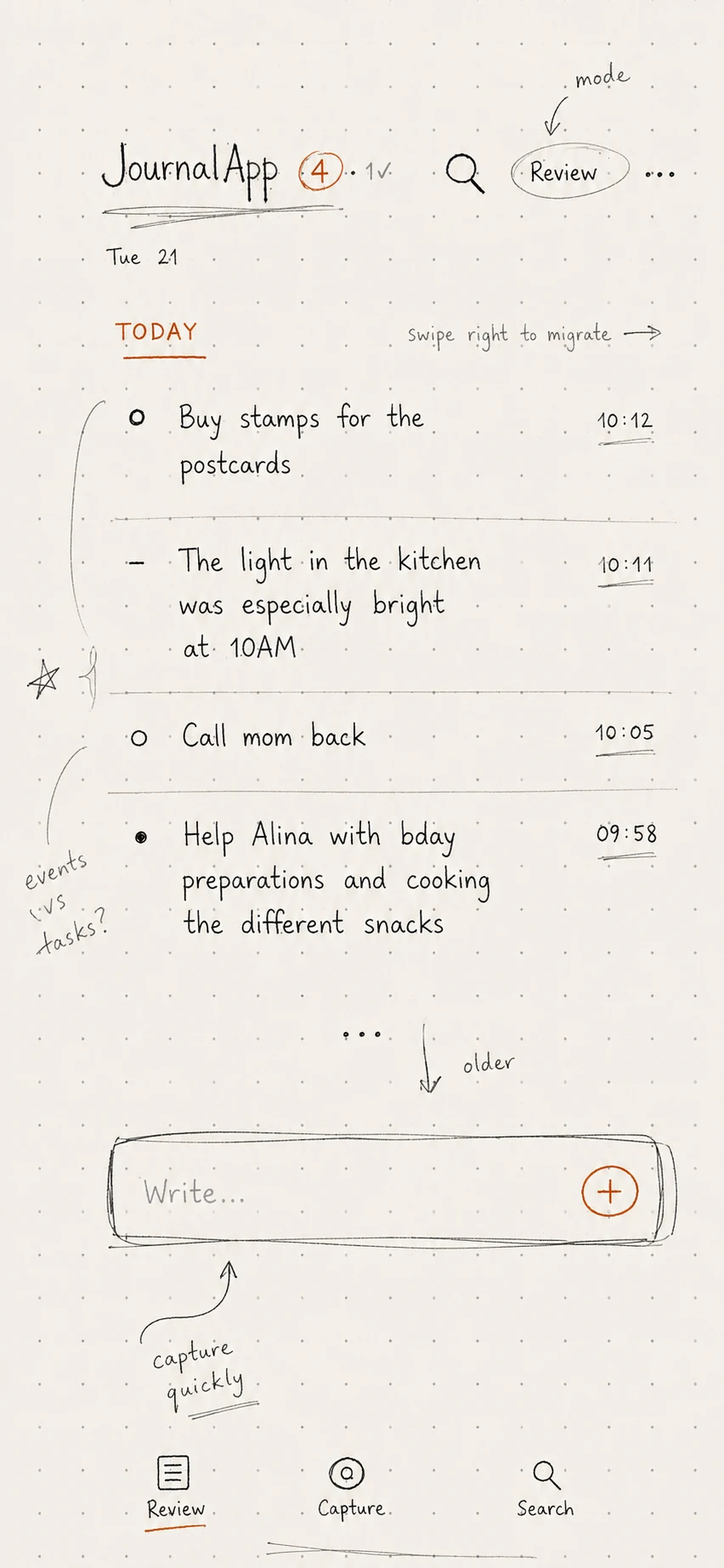
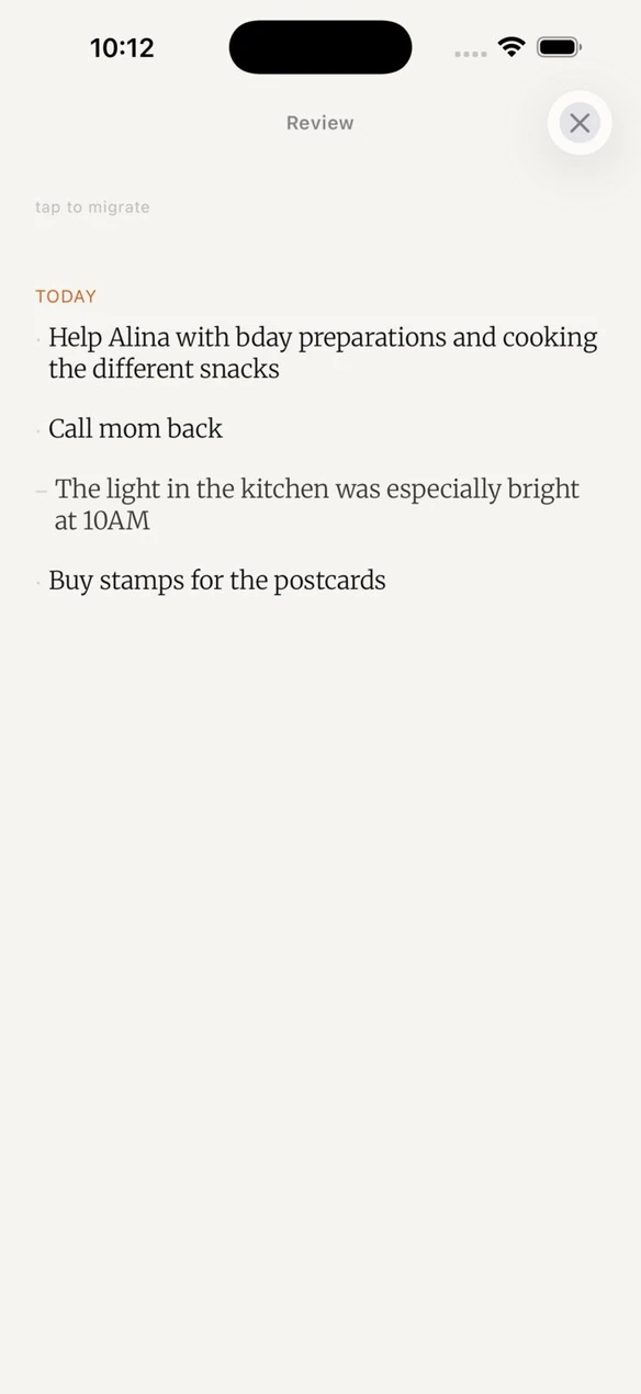
| Review | Review exists as a mode separate from Capture, even though both touch the same data: they’re different mental states (reactive vs. intentional), and merging them would weaken both. |
| Confirmation | No confirmation dialogs; a brief undo window instead. Confirmation communicates distrust; undo communicates confidence while still protecting against mistakes. |
| Storage | Local-first, no accounts or sync in version 1, consistent with the product’s temporary, ownership-first nature. |
From web MVP to native app
The web MVP (React + Vite, installable PWA) shipped in March 2026 and did its job: it validated the concept with real use. But from day one of the native process I set a strict rule to avoid the most common mistake when porting a product: never translate the MVP literally into SwiftUI. Every interaction had to be reinterpreted as if it had been designed natively for iOS from the start.
The MVP can give you ideas, but decisions made there can be revised. It’s a reference, not a specification.
In practice, that meant auditing every inherited assumption instead of taking it on faith. The clearest example was typography.
A real design-audit story: typography
Partway through the native build I had a feeling, not yet a finding: “I have the sense the design is still following the MVP too closely.” Instead of deciding from that intuition, I turned it into evidence. I compared real MVP screenshots against the native app’s current state and pulled exact values straight from the source code instead of trusting what the documentation claimed it did.
The finding: the discovery-phase documentation stated that Merriweather Sans should carry all of the interface chrome, on the assumption that this is what the MVP did. The MVP’s code said otherwise. Its chrome actually used the system typeface (San Francisco), and Merriweather Sans was only an alternate content font for the captured text itself. The native app had inherited a false premise.
The decision wasn’t automatic: a more literary sans for the chrome could legitimately be a deliberate native improvement. But adopted under the belief that “this is what the MVP did,” it counted as an unaudited carryover. My call was to use San Francisco for the chrome, matching what the MVP actually does and what Apple’s own HIG recommends for legibility at large accessibility sizes, letting Merriweather (the content serif) carry all the literary weight by contrast.
Typography isn’t incidental to me here. I’ve spent years working as a type designer and font developer, and I care about getting a pairing accurate rather than merely pleasant. San Francisco is Apple’s own system typeface, drawn specifically for legibility across an enormous range of sizes and contexts, from a status bar label to accessibility type at its largest, and built to disappear into the interface rather than draw attention to itself. Merriweather, designed by Eben Sorkin, was built for comfortable reading on screens: a serif with sturdy, ink-trap-influenced letterforms that hold up at body-text sizes without the fragility of some transitional serifs. Pairing a neutral, functional sans for the interface with a warmer, more literary serif for the captured content is a fairly classic move in editorial design, but it only earns its place if both typefaces are doing honest work rather than just sitting nicely next to each other. That’s the standard I held this pairing to: San Francisco has to disappear so the interface gets out of the way, and Merriweather has to carry enough warmth that a fleeting thought still feels like it’s being written somewhere, not just logged.
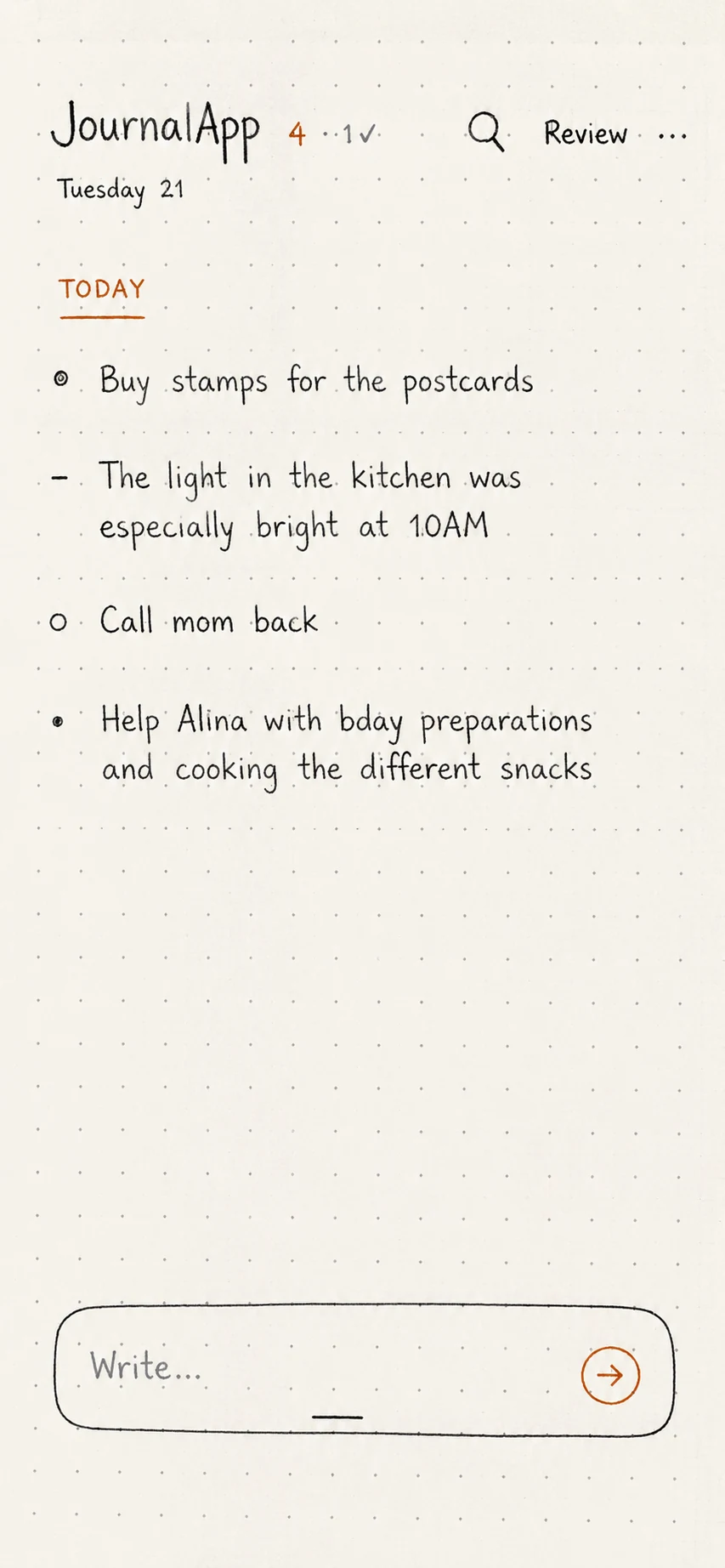
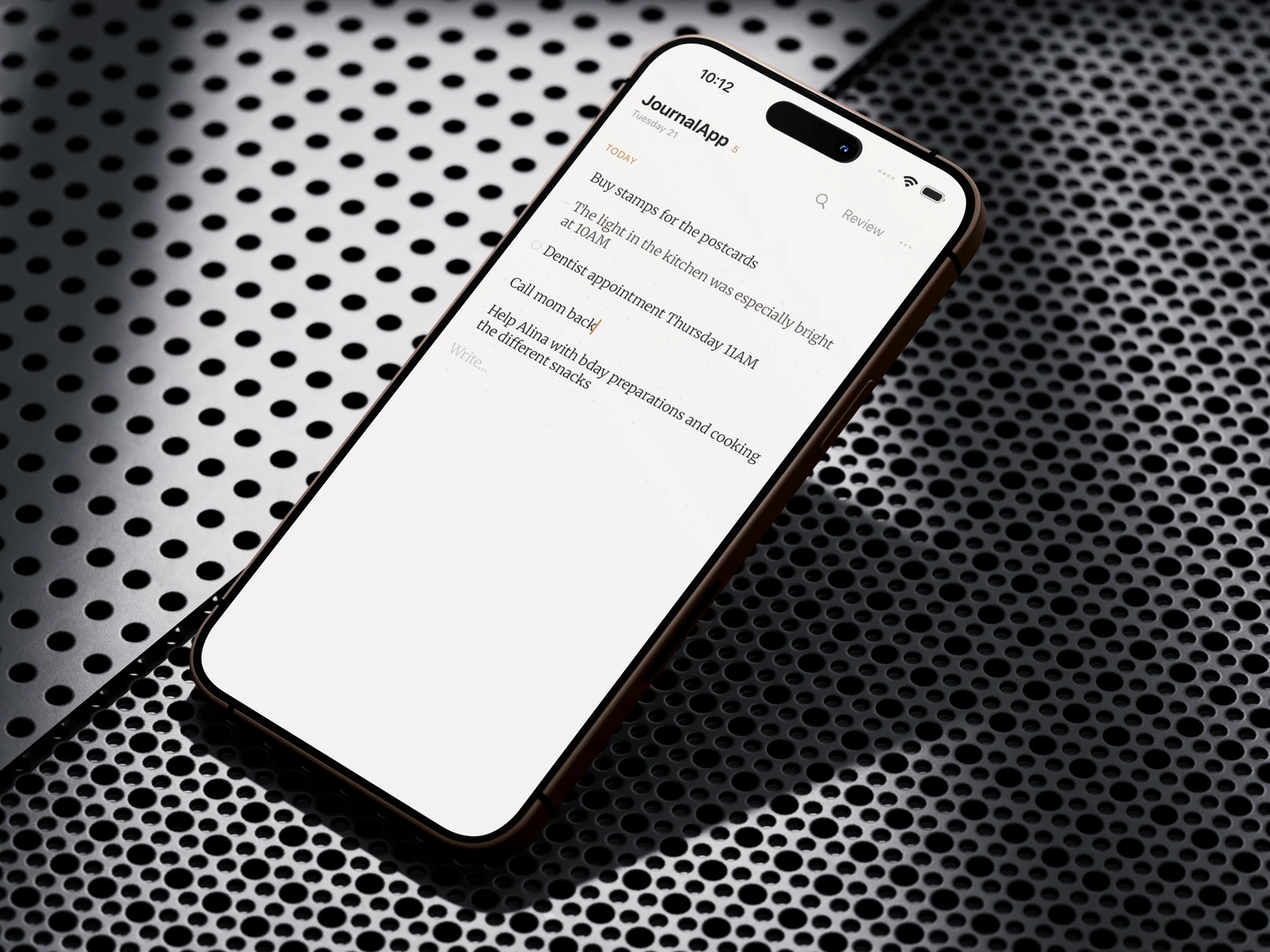
The same concept, reinterpreted: chrome in San Francisco, content in Merriweather, literal typographic notation instead of system icons.
The four fixed interactions
JournalApp’s entire interaction model rests on four gestures I treated as non-negotiable from early on, documented clearly so they wouldn’t drift over time:
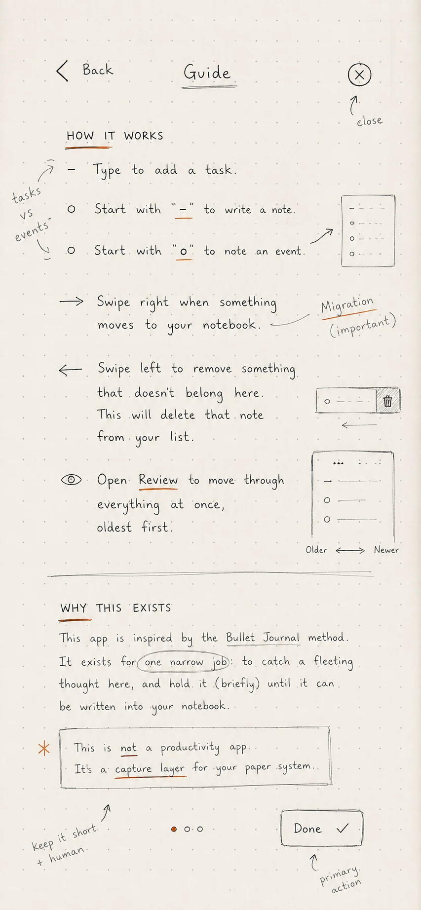
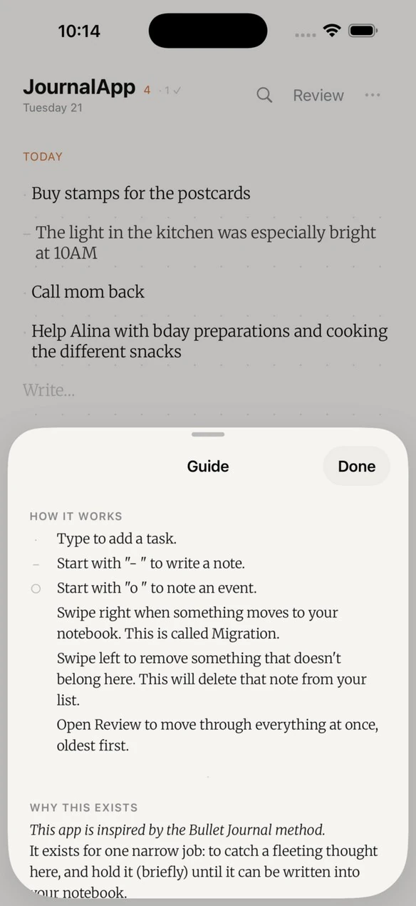
- Swipe left = delete, with a 3-second undo window.
- Swipe right = migrate, instant and with no undo: migrating and deleting shouldn’t feel equally reversible.
- No save button: autosave on every keystroke.
- One thought, one capture: no sub-notes or nesting.
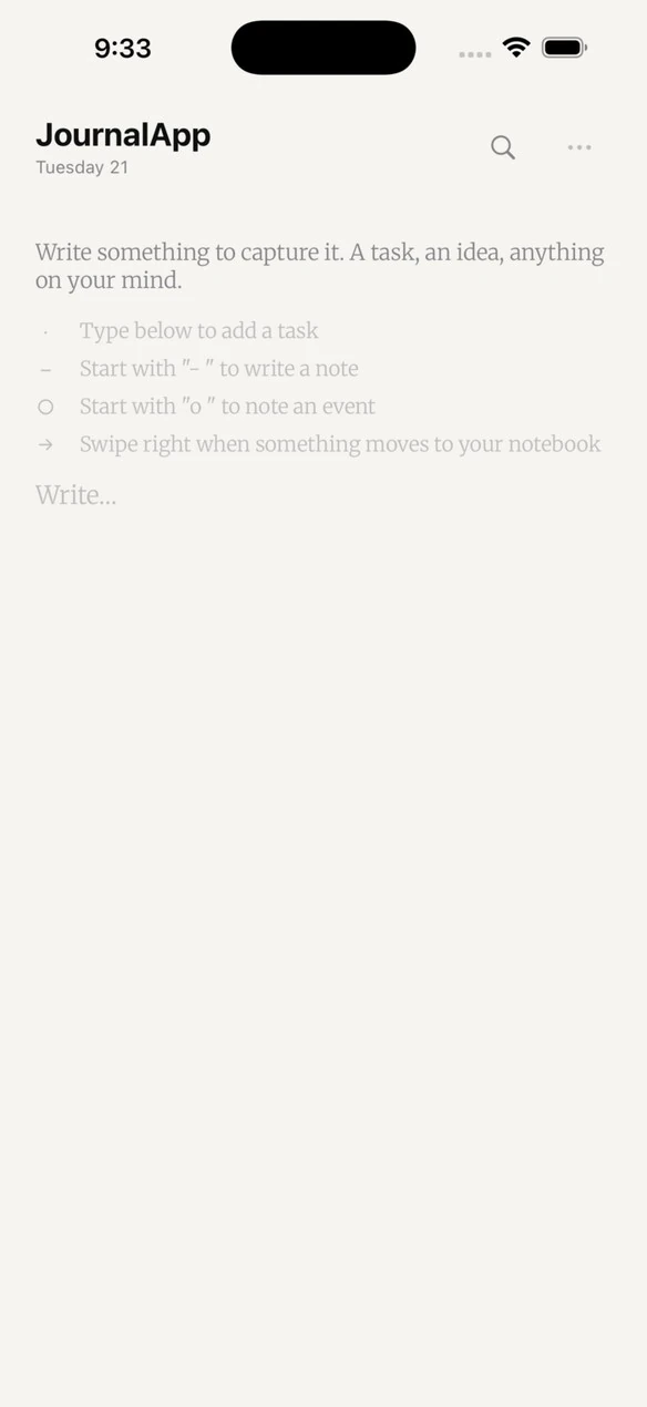
On top of that I built a notation system inherited directly from paper Bullet Journaling: “· ” for a task, “– ” for a note, “o ” for an event (rendered as °), and “* ” for priority (a boolean signifier on a task, not a fourth type). The marks render as real typographic characters, not system icons: a deliberate exception to my own “SF Symbols only” rule, because a Bullet Journal mark should read as something a hand would write, not as an interface glyph.
Visual system
The palette rests on a warm terracotta over paper backgrounds, deliberately inherited from the MVP after confirming that mapping to generic system colours “would flatten the product’s identity.” I expanded its presence literally, not decoratively: the text cursor, the pending count, the migrate action, and the “Today” group header are the only places it appears, each with its own functional meaning.
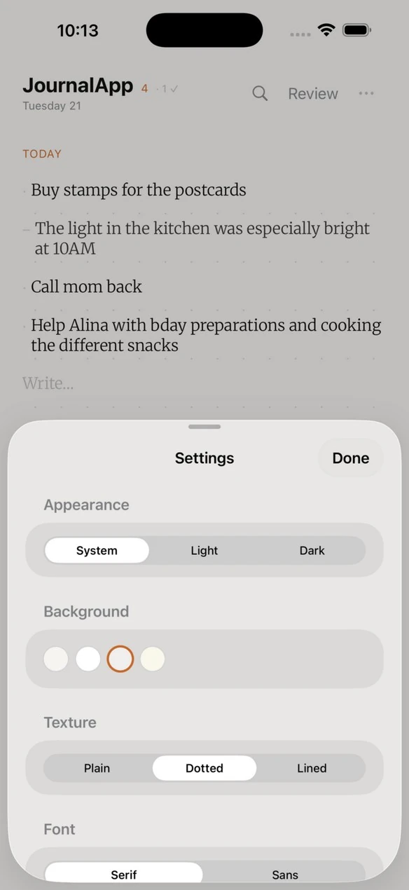
The paper textures (plain, dotted, lined) stay faithful to the MVP. A fourth option, a grid, was built, fixed over two rounds after real on-device problems surfaced, and ultimately removed entirely after trying it, not because it failed technically but because it wasn’t the right texture for the app. Keeping that discipline, pulling finished, working work when it doesn’t serve the concept, was one of the most important design decisions of the whole project.
Details that matter
The widget: five rounds of on-device iteration
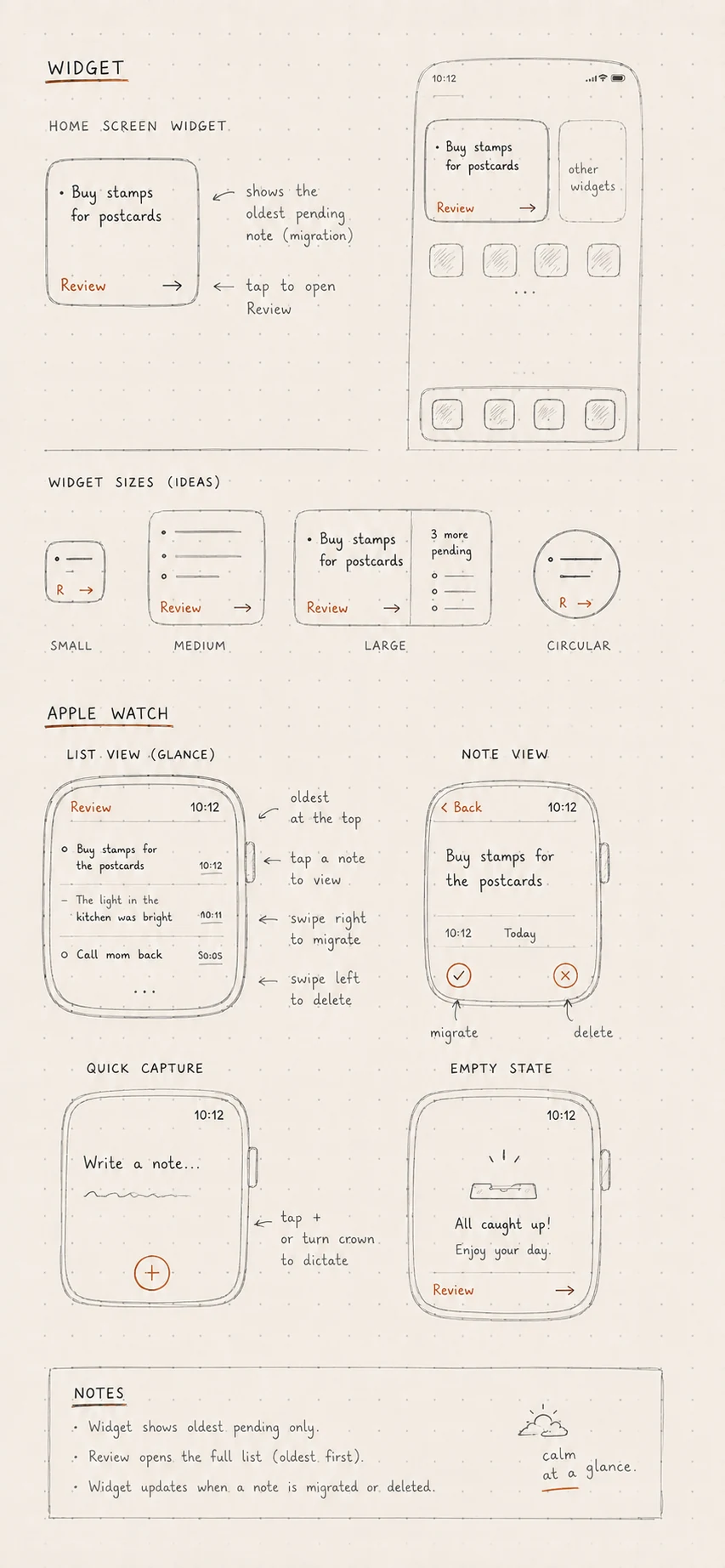
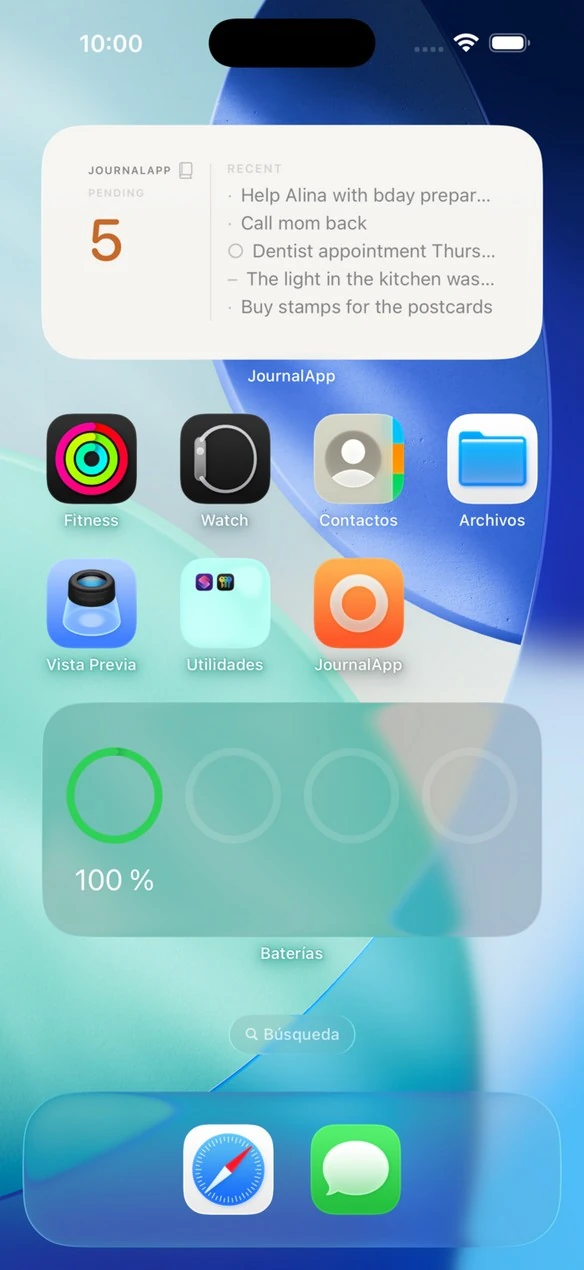
The Home Screen widget went through five refinement rounds based on real use on my own iPhone, not the simulator: first the terracotta accent moved onto the count itself; then the number grew and gained a “PENDING” label; later I resolved whether it should show the app’s name via a small wordmark and a book glyph; and finally I added a second, medium size showing recent pending items. The daily reminder, meanwhile, was resolved as a local notification rather than push: no server, no implied obligation, consistent with an app that never tracks anything.
Much of the final polish came from using the app myself, outside the simulator: near-invisible texture contrast in dark mode (~1.2:1, corrected to real contrast), menu tap targets below Apple’s 44×44pt minimum, or a share sheet rendering incorrectly because it was nested inside a popover. None of those problems were visible in simulator screenshots. They only surfaced from carrying the app in my pocket for a full day.
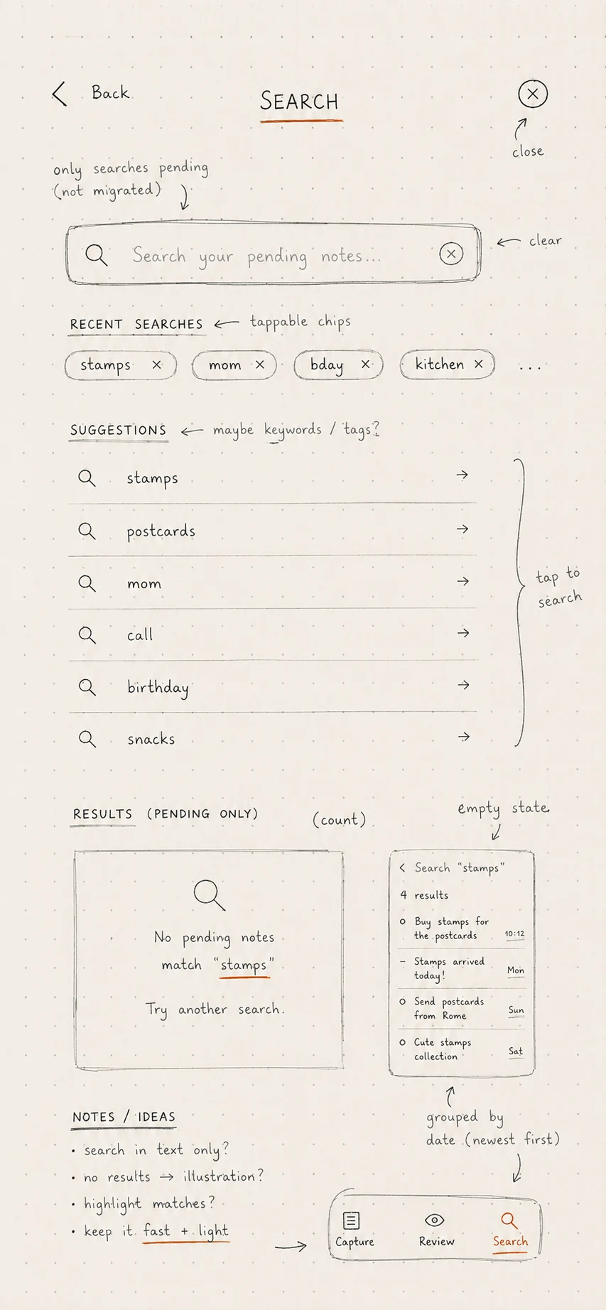
Screens
Outcome and validation
The project closed its fifth phase with a two-part QA pass: first a full walkthrough on the iPhone 17 Pro Max simulator with the debug console open (capture, edit, delete, migrate, search, settings and export, no warnings or crashes), and then a guided test on my own physical iPhone, screen by screen, with specific questions instead of a generic “does this look right.” All six checks (splash, capture, delete/migrate gestures, live settings, widget and Review) were confirmed with no issues.
JournalApp now lives as v1.0 on TestFlight: a native iOS app with instant capture, Bullet Journal notation, migration and review, a Home Screen widget, and a visual system built and audited document by document, decision by decision.
Reflection
What I value most about this project isn’t any single screen, but the discipline of the process: writing the philosophy before the code, auditing every assumption inherited from the MVP instead of taking it for granted, and being willing to build something complete (a grid texture, a weekly-calendar gesture) and pull it once it was built and tested and simply didn’t serve the concept. In a product whose measure of success is that the user “barely remembers using the app,” that same restraint had to govern my own design process too.
If a future version of JournalApp forgets any of this, it isn’t JournalApp anymore. It’s just another notes app.